AMERICAN AIRLINES
American Airlines engaged us to redesign their check-in experience which rolled out to over 1200 airports worldwide. Passengers were faced with 2 challenges when arriving to the airport to checkin:
- Passengers were afraid of the kiosk machine and preferred to talk to a ticket agent to checkin to their flight.
- When used, the average session was 2 minute. 2 minutes too long.
While the dated kiosk hardware and running flash would remain, we designed an intuitive, streamlined process that provides a direct path for those just wanting to check-in while allowing for optional merchandising for those with a bit more time on their hands.
PROJECT
Airport check-in kiosk redesign
AGENCY
SapientNitro
ROLE
Associate Creative Director, UX
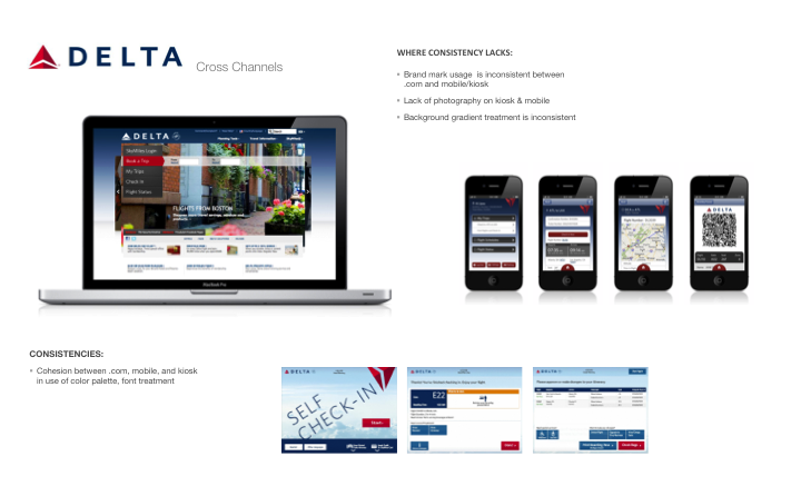
COMPARING THE LANDSCAPE


UNDERSTANDING THE USER JOURNEY
We defined the customer experience by user desire across in airport, online, and on the go.


CONCEPTING
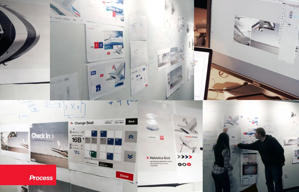

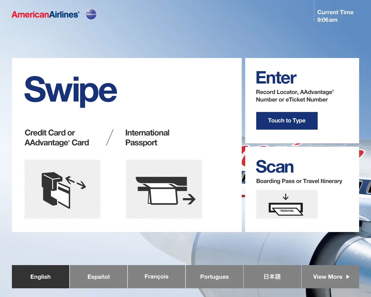
STREAMLINING THE PROCESS
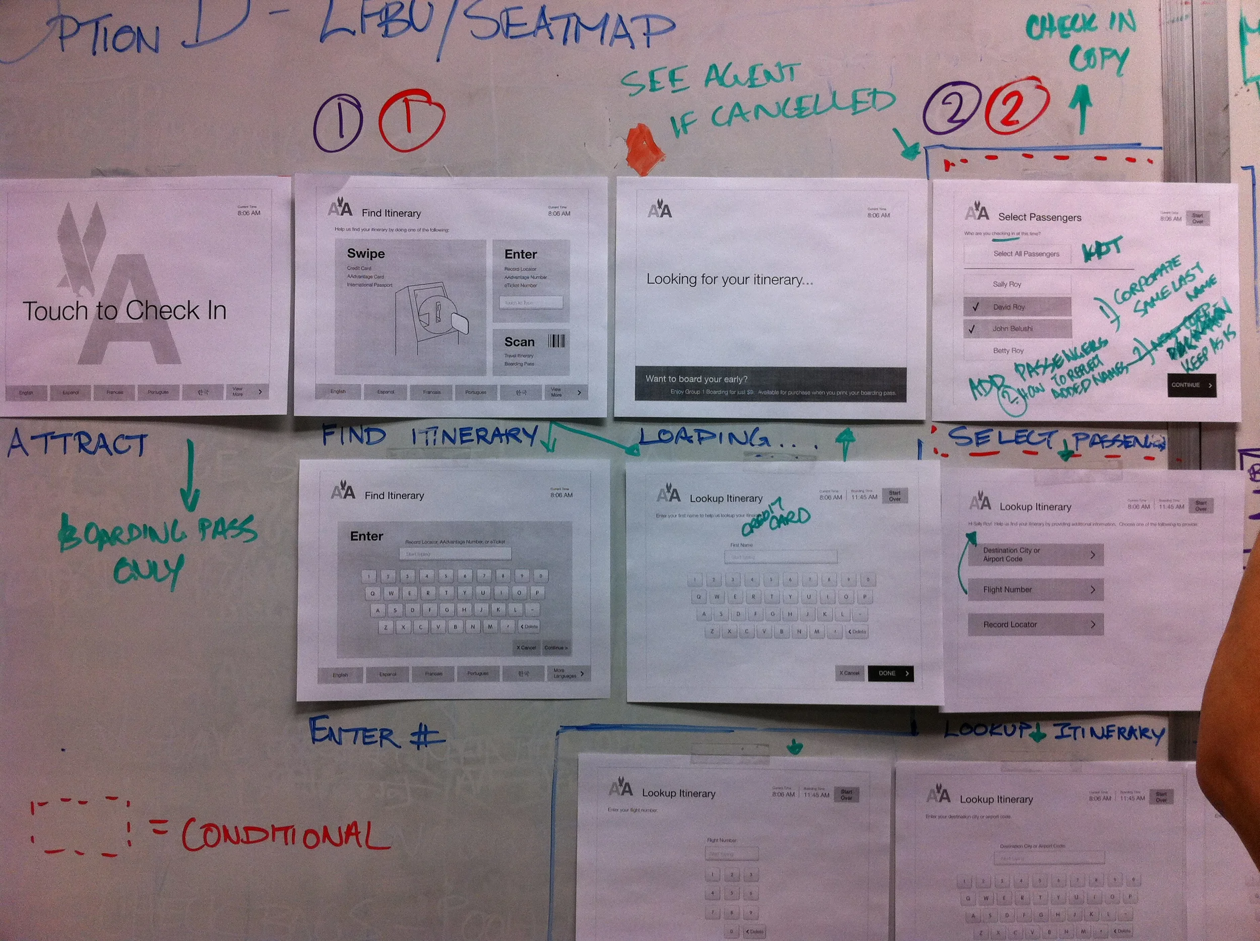
Original Flow
In the original flow, a passenger traveling alone on a domestic flight
had to complete 9 screens in order to print a boarding pass.
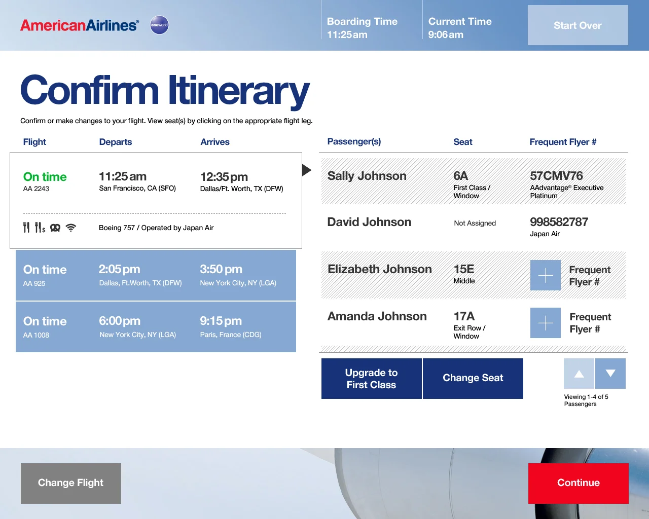
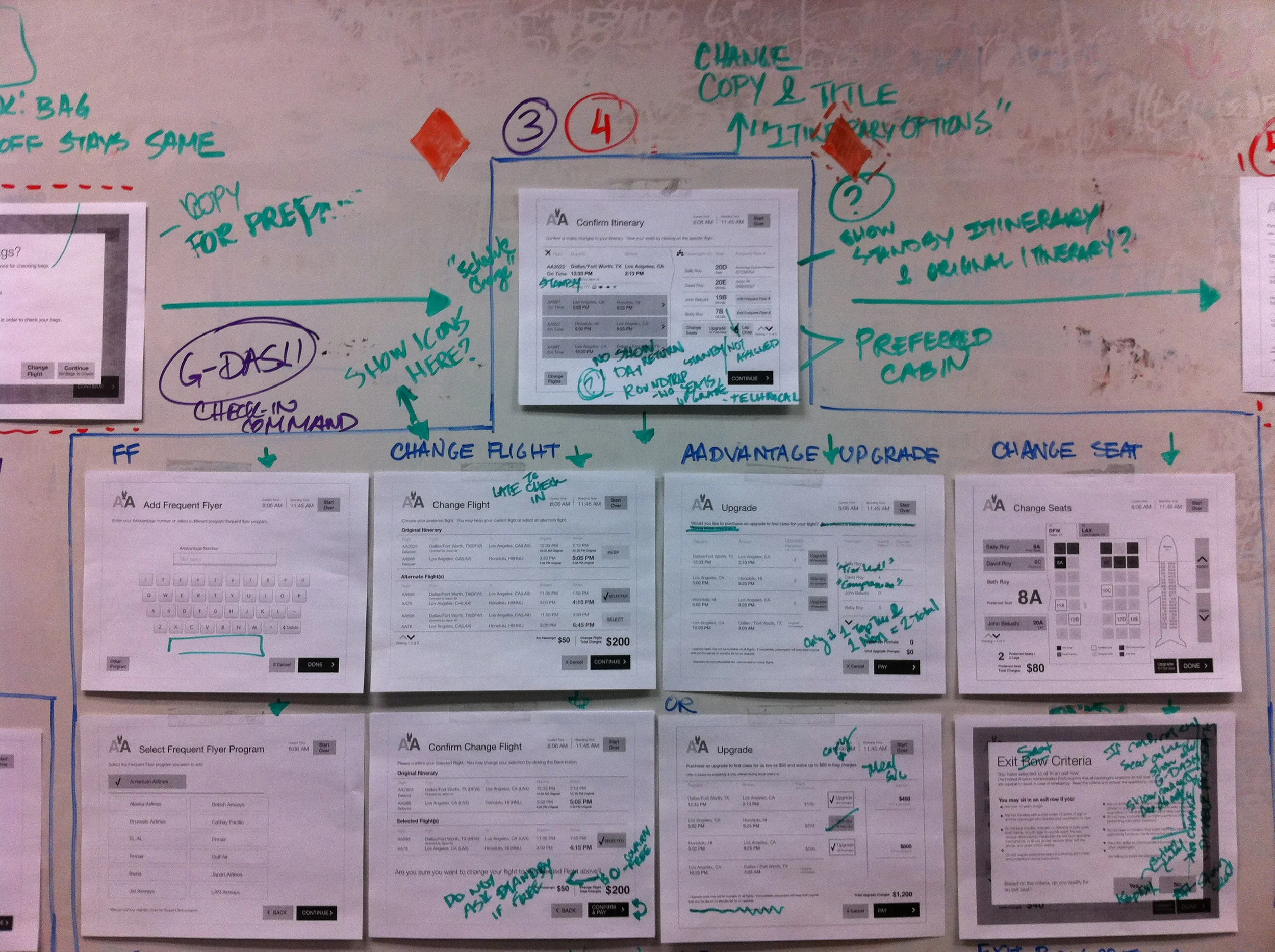
A New, Streamlined Flow
We proposed a flow that cut the number of steps needed
for check-in into 3 and put the user in control to optionally
fork off from the main flow if they choose.

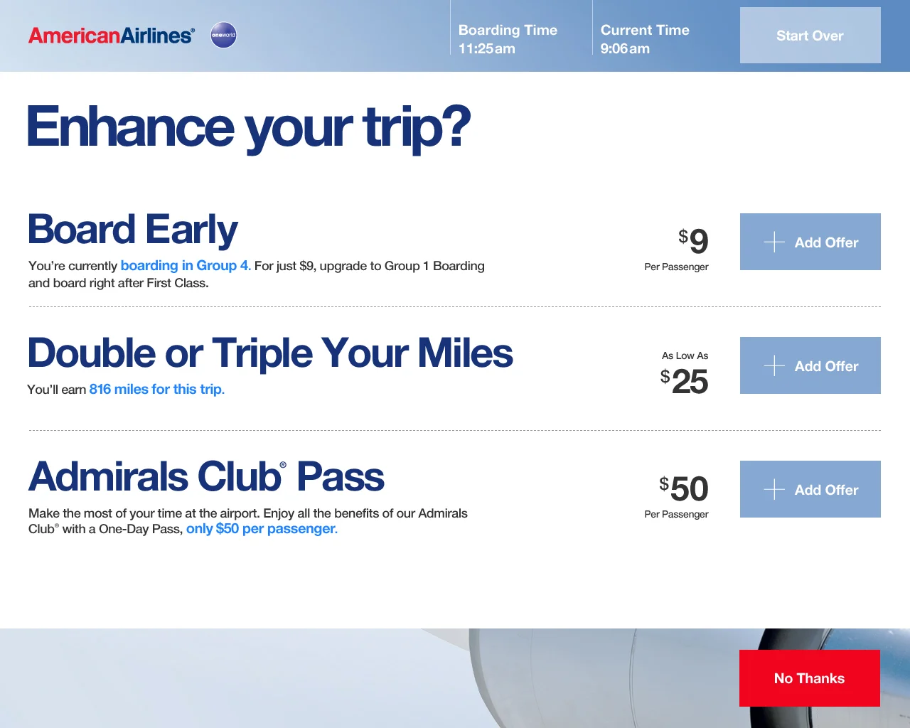
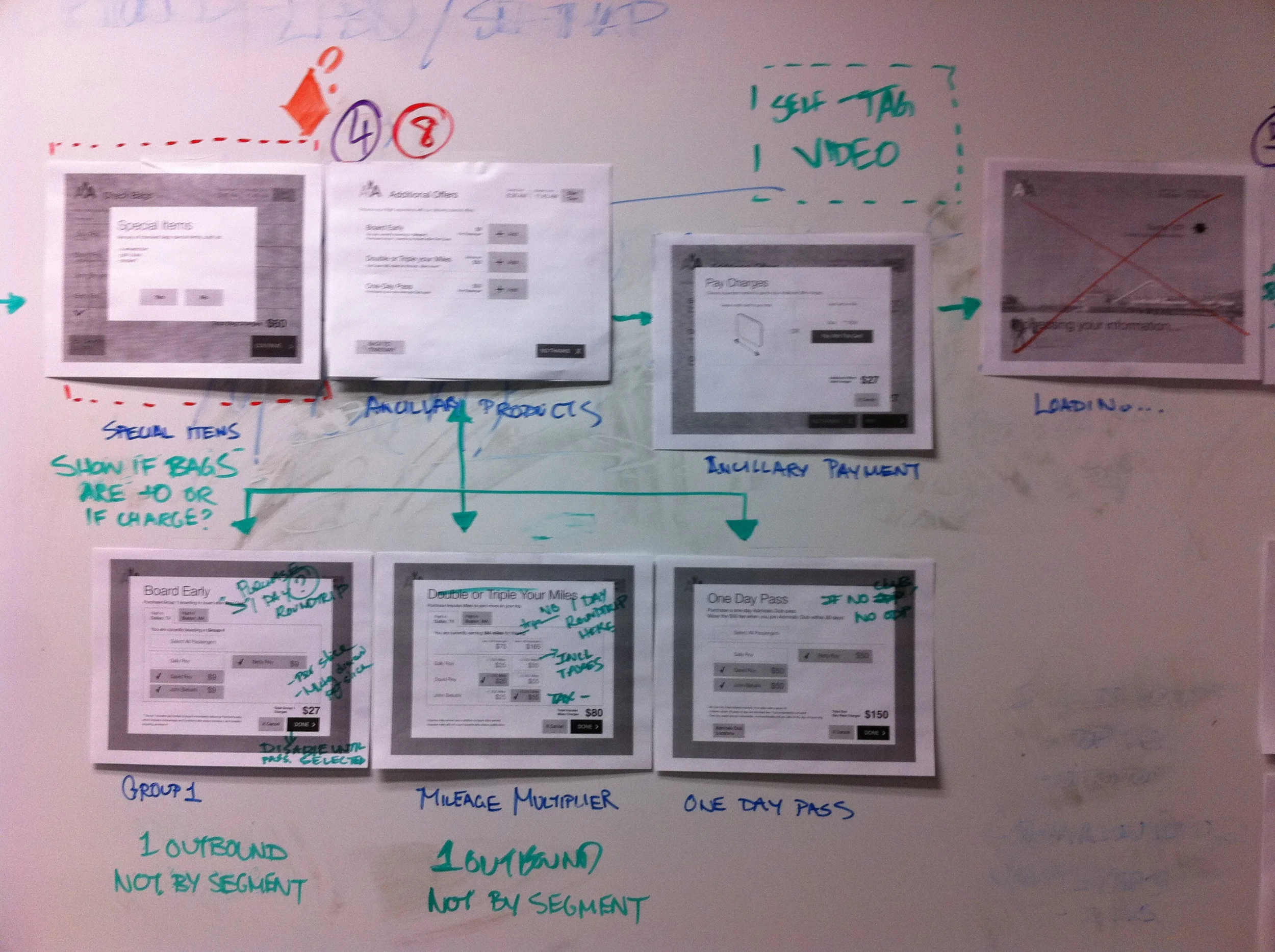
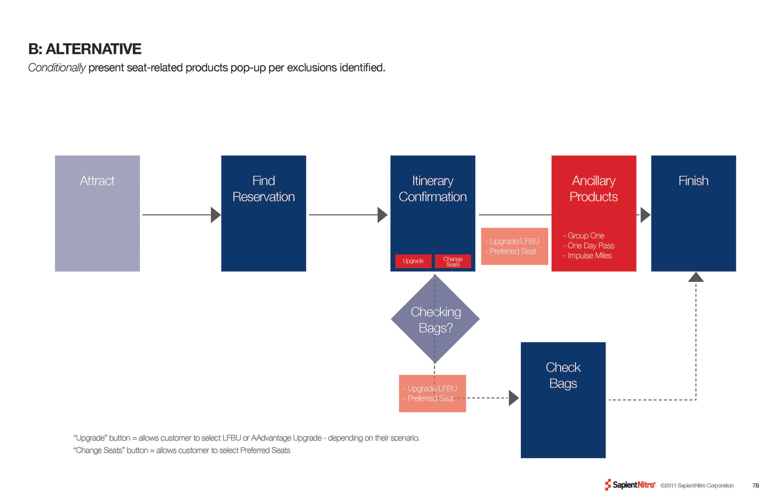
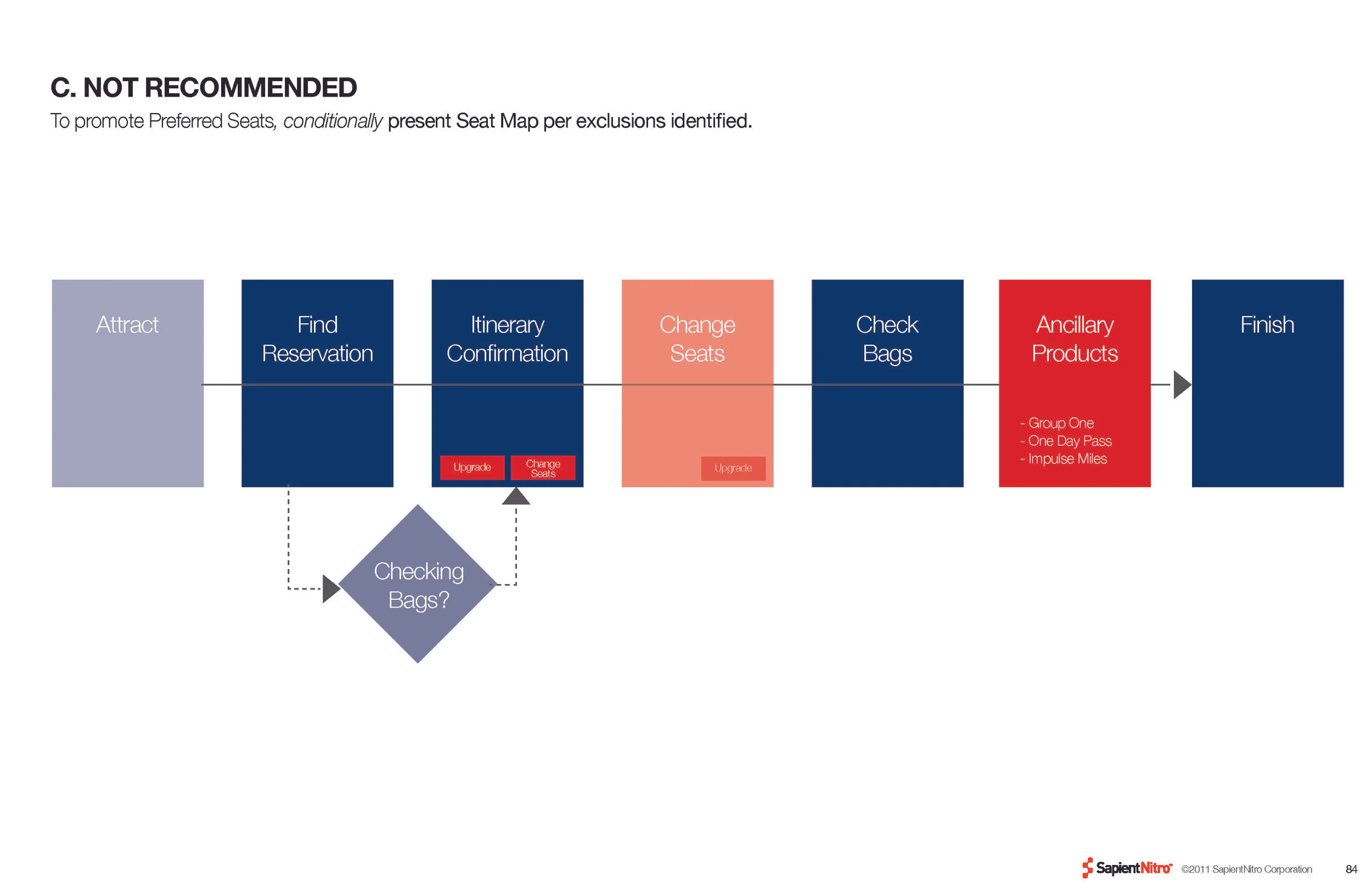
MERCHANDISING UPSELL EXPLORATION
In addition to streamlining the flow and number of steps, we were also faced with the challenge of driving additional sales through merchandising (seat upgrades, early boarding, etc). We explored a various number of flows and engaged in user testing to define the right placement and cadence of the upsell moments.


BEFORE


AFTER
Bold, simple choices allow the passenger to get started. We referenced boarding passes to provide a familiar hierarchy for the most important passenger information. Color-coded choices that distinguish optional from required steps were also introduced. Last but not least, we set it all on a black & white palette of beautiful shots of aircrafts.